 back
to main account page back
to main account page |
| First
Draft Designs - scroll
down the page to view the 2 concepts |
|
|
*Please
read the simple overview and notes below for each of the first 2 concepts
for the homepage design of the multimedia brochure. Some of the things
I felt strongly about as I thought of STC of Boston, were the following:
- It
is Boston based
- It
is Historical, yet changes with the times
- It
is a vibrant community
I
held these thoughts as I created these concepts.
These
are currently just some rough sketches and layouts to help us find the
right path to a final design/concept through further discussions...
Note:
There are 2 designs that each have 2 slightly different color schemes,
so there are a total of 4 designs on this page to scroll through...
|
 |
 |
 |
 |
| Design
1: Successful and Sophisticated |
|
Goal:
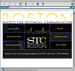
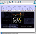
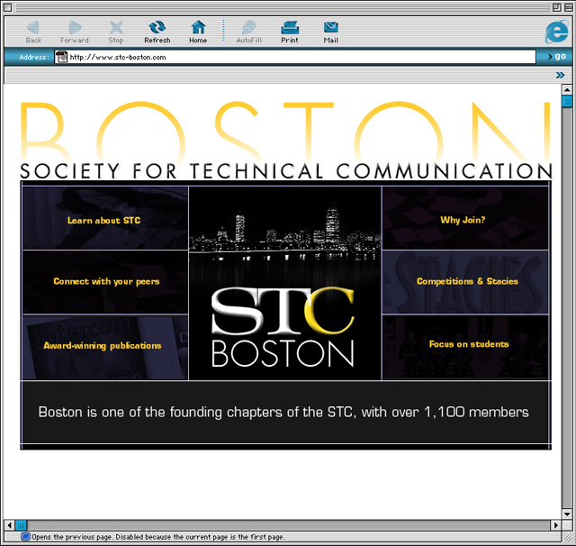
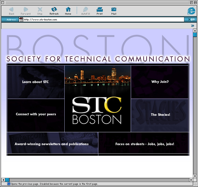
For concept 1, I decided to use a theme that demonstrated STC Boston
as a proud historical society that has class and dignity. The design
directs your eye first to the Boston skyline at night, as either a black
and white skyline or colored skyline, placed in the center of the page,
with the STC logo below the skyline. I see some type of animation focused
here on the skyline and logo (we can go in more detail at the meeting).
Surrounding the skyline the user's eye should follow the navigational
areas of the multimedia brochure. They are designed to feel like buttons
that when rolled over will create an interactive response. This will
have allow for a nice and crisp visual effect. I also think about using
the bottom of the design to possibly rotate news or important items
you may want to highlight. The colors I used to help define the feeling
of this concept are the strong bold colors of dark blues and purples,
outlined in blacks and grays, and then contrasted with white and light
blue background and yellow/or white highlights for the text.
Design
1 version 1

Design
1 version 2:

|
| Design
2 - Elegant, Simple and Fun |
|
Goal:
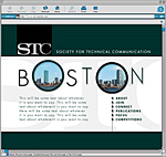
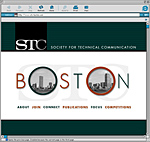
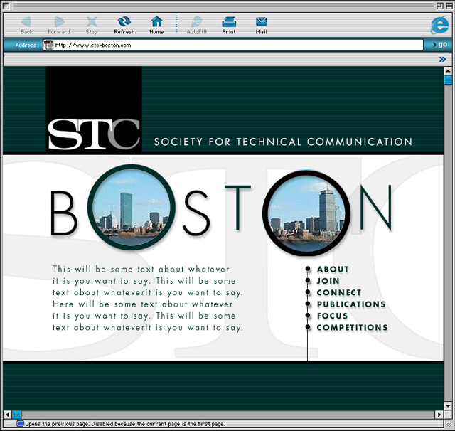
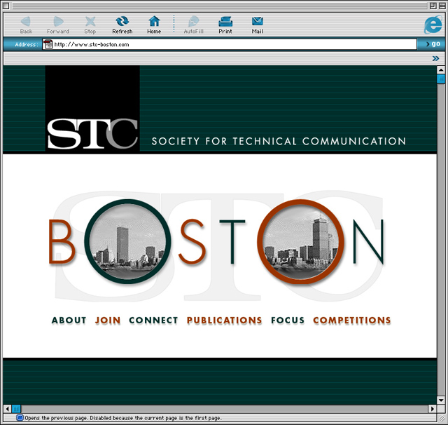
For concept 2, I decided to make the homepage concept to look more
cutting edge/hip. I decided the design theme would be based around the
word Boston, using the 2 O's in Boston as the main "windows"
for the page. Those circles will be a basis for any interactivity we
will use, and will provide a focal point for your eye. Ex. We can use
it to have images fade in and out, or have them swap different images
when you rollover certain areas, etc. Basically it will be a place for
the users eye to focus on when looking at the design for stimulation.
The navigation will be based with some simple bars either placed horizontally
or vertically. I think this design will play great for a simple yet,
elegant layout - that will allow for some fun interactivity. The colors
represent some crisp and clean shades of green, grays and black, as
well as the option of green and burnt oranges. I feel these colors give
a cutting edge feel for this type of design.
Design
2 version 1

Design
2 version 2

|
| |
